|
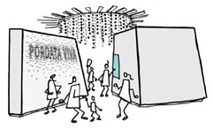
The beauty of data
The idea that statistical data can be beautiful is illustrated by a giant sculpture on the ceiling formed by balls of different colours representing data related to the economy of the European Union countries. By observing the positions of the balls we can analyse if a country sells more than it buys from the rest of the world, compare the results of different countries, and see that evolution over time. The sculpture has its own beauty, but the actual allure of the data lies in the information it conveys.
|
|
DJ Data
Statistical data have rhythms and, just like music, they also transmit emotions. Thus, the “DJ Data” is a computer game that can be played by two people: a DJ and a dancer. The object of the game is to control the music volume to adjust it to graphs containing actual data. For this, the DJ has to scratch the surface of a plate and the dancer has to jump to different rhythms. The winner is whoever was best at matching the rhythm of the music to the rhythm of the data.
The game has three levels of increasing difficulty, which correspond to different statistical indicators: the evolution of the number of internet subscribers in Portugal; Portuguese medals won in sports competitions; number of movie sessions in Portugal.
|
|

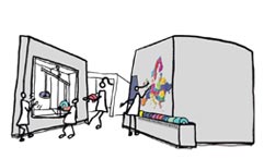
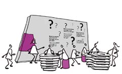
What country is this?
Statistical data help to shape reality. With the multimedia quiz "What country is this?" Portugal acquires different sizes. In the deformed maps, the areas of each municipality do not correspond to their actual surface areas, but to the importance of the statistical indicators. The maps have odd shapes, as if Portugal had been stretched and clamped in different ways, depending on the indicator in question. The object of this game is to discover which are the data represented in each map.
|
|
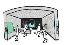
Europe on the scale
Statistical data are not equal for all. At a time when in Europe the different Member States' performances are constantly being compared, it is best to put them on the balance scales. Here, visitors can literally compare the "weight" of each country to the total GDP – measure of wealth created – of Europe.
|
|
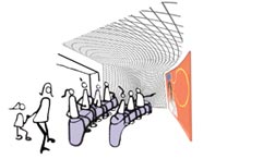
Tell me stories
Statistical data also tell stories about us! In the mini-auditorium of the Pordata Viva exhibition, José Diogo Quintela guides us through the data, in a journey back to the 1960s. In the late sixties, man first stepped on the Moon. However, in Portugal, more than half of the dwellings still did not have running water, no shower or bath. What other amazing stories can data tell us?
|
|
Debunker
There are preconceived ideas that do not withstand scrutiny. Are there really seven women for every man? And is Portugal a small country? So small, that it practically consists of Lisbon and the rest is landscape? Is it true that we are a country of university graduates who do not work much? And that we have been invaded by foreigners? In “Debunker” the myths are confronted with the data. Will they survive?
|
|
Flashback
Statistical data also signal changes. A television set shows news of Portugal and the world over the last 50 years. In 1961, Portugal was at war. In 1969, Man landed on the Moon. In 1974, we made a revolution and in 1975 we had the first free elections. In 1979, the National Health Service was introduced in Portugal. In 1986, we joined the EEC. In 1989, the Berlin Wall fell and, in 1998, the Expo '98 rose in Lisbon. In 2002, Euro notes and coins began to circulate and, in 2008, Lehman Brothers went bankrupt. In 2010, Pordata was born.
To see some of the changes in Portuguese society during these decades, just follow the data.
|
|

Now what?
Just like people, statistical data are dynamic. How many people were born in Portugal today? Between the Portuguese who went abroad to live and the foreigners who came to live here, what is the balance in the Portuguese population? How much money did the Portuguese Government spend today in education? Back to the present, six counters show us the predictions for some statistical indicators updated to the minute.
How would the world be if there were no data?
|